
A Look into the Accuracy of Maps

The Mercator Map
January 7, 2022
World maps are some of the most common items you will find in a school. It is nearly impossible to walk into a history classroom without one. This makes sense. They are a helpful tool; if you need to find a country, city, or region, a map is always there for you to use. It is also a convenient reference when discussing world politics with many borders and nations. While, for the most part, maps can be a handy component in the classroom, they can also be somewhat inaccurate. As we all know, the earth is a globe. For this reason, it is complicated to project the planet on a flat surface. Over the centuries, many attempts have been made to produce the most accurate globe projection, but two have taken the cake for the most popular. The first is the Mercator projection. You might have seen it, as it is one of the most common projections globally and used by Google Maps. However, the projection has become infamous for its numerous flaws and inaccuracies. For instance, the island of Greenland, which can fit in the contiguous United States almost four times, is presented as being as large as the continent of Africa. In addition to this, Russia is shown as being disproportionately
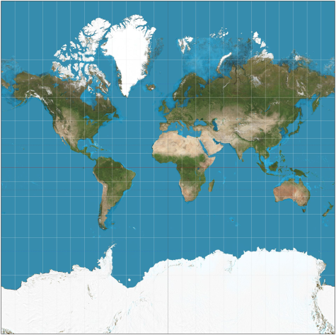
large. Antarctica is also presented as a giant ice-covered behemoth sitting at the bottom of the map, due to the fact that towards the equator, the continents are shown as being equally proportioned, while in the very north and south they are usually enlarged, due to the curve of the earth. The maps’ primary purpose is for navigation. It is easy for sailors to draw a straight line from two points.
Over the years, there have been numerous attempts to change the map to make it more accurate. The Equirectangular projection takes the basic Mercator and “squashes” the north and south portions of the map. While it is a little more accurate, it still, in many ways, appears distorted. While flat maps are bound to have inaccuracies, some flat maps do a pretty good job of presenting the earth’s surface. Enter stage left, the Robinson Projection. The Robinson Projection ditches the rectangular map for a more oval shape with flat sides. It does not stretch the very north and south out of proportion but morphs them in a way to make them somewhat equal with the rest of the map. While not one hundred percent perfect, it is a much better alternative to the Mercator in many aspects.
In conclusion, maps do not have one simple design but are as diverse as the country and continents they convey.