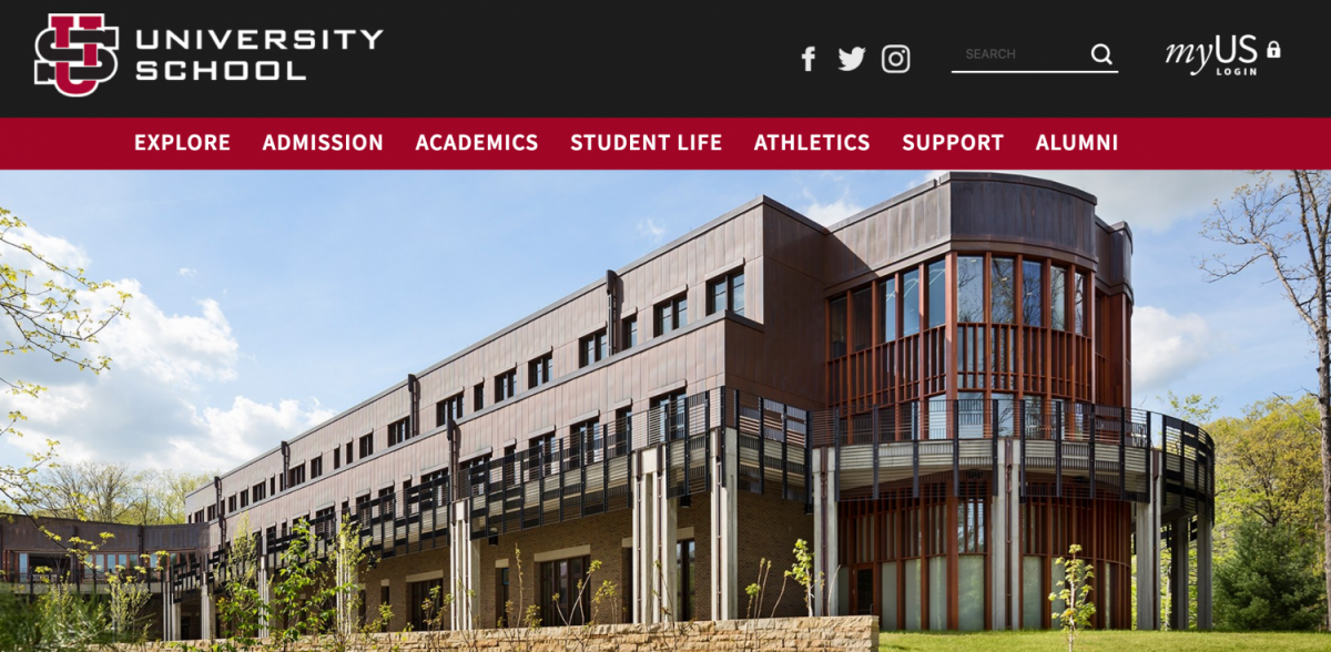
The Revamped US Website
September 24, 2017
Sometime, in late 2016 and early 2017, the US website went through a complete transformation. From being a website from late antiquity, the website evolved to a more modern design. One key feature that improved the US community’s response towards the website was the addition of more photos and media of students. Honestly, the website looks better than it has in years! With the news tabs and the sports updates, I feel more connected than ever before. This new website gives a more accurate picture of the US life, with more pictures, news stories, and frequent updates about what is going on at US. Besides these benefits, prospective parents and students looking at the US website will be impressed by how professional the website looks and might give US a second thought. As well, more people would be inclined to follow US on social media due to the fact that its website is so professional. After all, if an institution takes pride in its media outlets, it must be committed to its cause. In addition to bringing in prospective students and parents, the new website can even draw in prospective employees or teachers that would be impressed by the US website so much, that they would consider US as a place of employment.

